Nested Acrylic Prints...
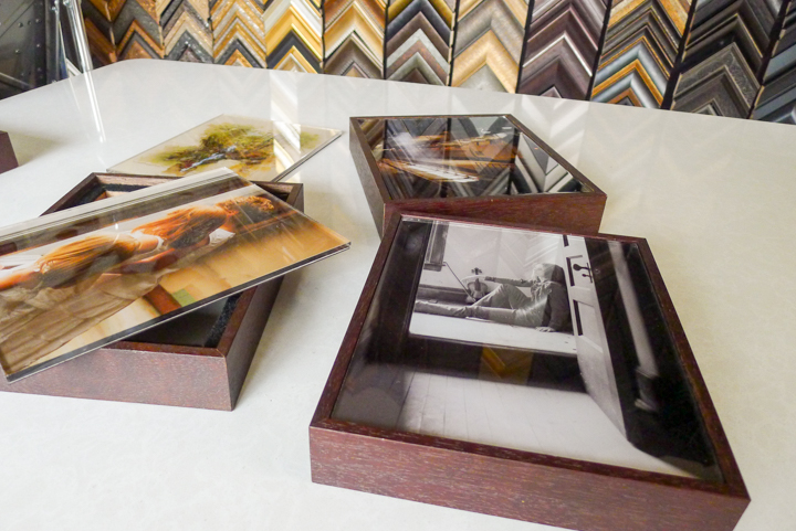
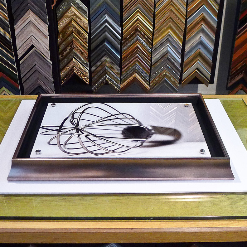
One of the products we have been working on is a
'nested' Red Wing
Digital Acrylic
Print.
We have learned over the past two years is that a
naked Acrylic Print seemed to be too contemporary for
most Midwestern tastes. So we modified it by
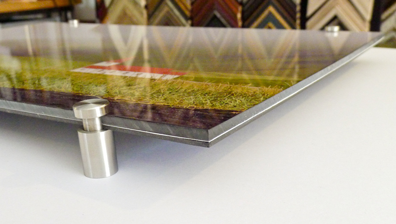
'nesting' it in a framed box. It still has some
striking high gloss effects, but the more traditional
framing design makes the product more attractive to a
broader audience.
Next month we are taking the Boxed Acrylic Prints on
a West Coast road show to drum up some interest from
the client base.
Wish us luck!
The Physics of the Acrylic Print
Acrylic
Prints have unique optical properties because of the
underlying physics of visible light traveling through
the acrylic layer.
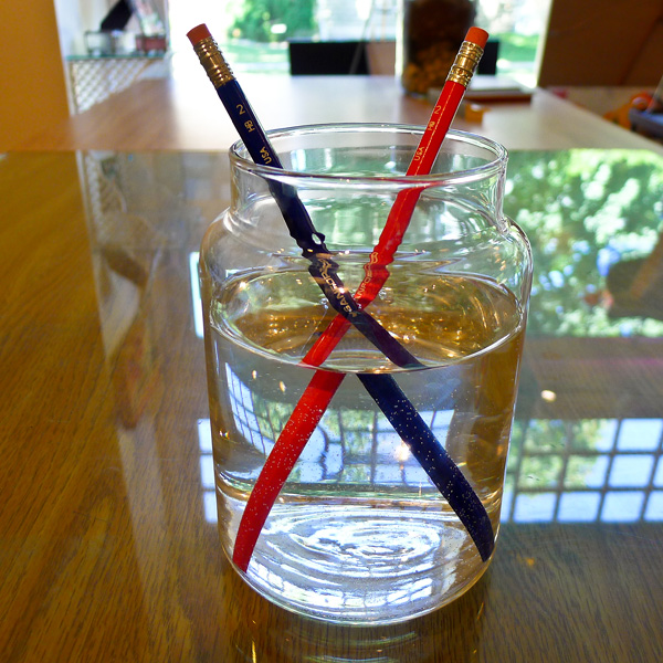
A property of visible light (or white light) is that
the light waves are slightly bent as the light passes
from one medium (air) to another medium (in the above
example; water). This bending of the light is called
light refraction.
Light refraction has two impacts on the observed
image:
1) Because of the bent light, the observed object
appears slightly magnified, which gives the image
added clarity. Light refraction is the underlying
principle of optical lens technology you would find
in a camera or a microscope.
2) The bent light will also experience a slight shift
in the visible light spectrum, which adds vibrancy to
the observed colors (explained below the prism
image).
A
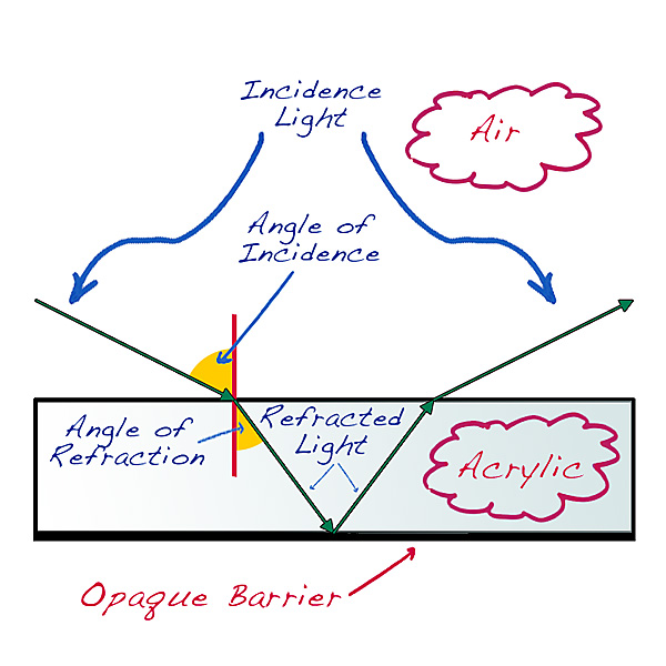
simplified example of what is happening with the
Acrylic Print can be see above.
Incident light (the ambient light all around us) is
slightly bent as it enterers the acrylic layer.
The altered and shortened light path continues to
travel until the opaque barrier on the backside
reflects the light back up and out the acrylic layer.
The light is bent once again and travels to the eye
of the observer.
Because the light is traveling a miniscule shorter
distance, the image has a miniscule amount of
magnification. This is why the pencils in the
water appear slightly larger.
This slight magnification provides an enhanced
clarity to the image, which is subconciously
perceptible to the human eye.
It essence, the acrylic layer is behaving like a
lens.
This example also points out the importance of the
opaque barrier. If light is allowed to 'leak' out
through the back of the print, the clarity impact is
lost because the light is not reflected back to the
eye.
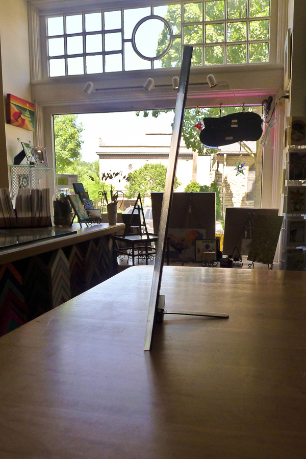
A
profile view of the Acrylic Print points out how the
construction of the Acrylic Print both traps light
within the acrylic layer and reflects light back to
the observer.
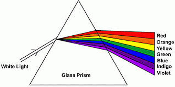
Another
consequence of bending the light is a slight shift of
the visible color spectrum.
Every
time the light is bent, the ultraviolet (UV) portion
of the light spectrum becomes slightly more dominant
and the infrared (IR) portion of the light spectrum
becomes less dominant.
IR
light has a longer wavelength than UV light and UV
light has more energy. When white light is
bent, the UV portion of the light spectrum is more
impacted.
Human
eyes are especially sensitive to the UV portion of
the white light spectrum and colors under a
UV-dominant spectrum appear to be especially vibrant.
This
is exactly why diamonds have a sense of luster. The
light is bent multiple times within the diamond and
the the spectrum shift becomes even more exaggerated
and pronounced each time it is
bent.
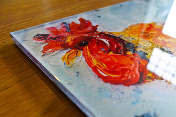
The
net result of the these two principles of light is an
Acrylic Print image that has both exceptional clarity
and luminance.
It
is really striking to see
firsthand.
The Acrylic Print
For
the past six months we have been quietly, but
diligently working on a new family of products that
we call the Acrylic Print.
The idea was to have a premium family of products
that would compliment the Panel Prints.
It took several iterations, but we are delighted to
introduce the Acrylic Print. We are very excited
about the sharp and vivid details this presentation
package provides.
More details can be found at
Red Wing Digital.
Catch-up/ketchup
We have been very busy re-inventing here at the shop.
To begin with, we have been very focused on slowly
unveiling Red Wing
Digital. Red Wing Digital is a print-on-demand
product that provides unique large-format
presentation products, namely the
Panel Print and the
Acrylic Print. The Acrylic Print is slowly
getting ready for production, but it has taken longer
than hoped.
Secondly, we have a new business partner. Fine Art
Prints on Demand is a United Kingdom company.
This is a side of the business (printing and framing
fulfillment) we have been quietly working and growing
for a number of years. FAPoD is our third customer
for this side of the business.
These two developments have driven our third
initiative. We are moving our production to a larger
facility. We have narrowed our options down and
expect to be able to make some final decisions
shortly.
On the topic of work, road trips & writer's block
It
has almost been six months to the day that this blog
has been updated. This is inexcusable and
consequently here are the excuses;
1) It has been very, very busy at the shop. The crush
began in August (the last blog posting) and has been
unrelenting ever since. The simple solution would be
to hire additional help to manage the workload and to
some degree that was the solution. But as a business
survivor of 2008 (remember Lehman Brothers?), you
learn not to trust short term business trends. So you
suck it up, put in long hours and satisfy each and
every customer.
2) Contributing to this work crush has been the
success of the new products at RedWingDigital.com.
This is a new business model for us and it takes time
to hammer out a smooth workflow. But if it were easy,
everybody would be doing it. Look for new products
soon.
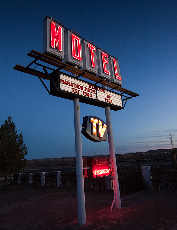
3) It is supposed to be quiet in January so we closed
the shop for ten days and took a long road trip to
the most remote part of the United States that we
could find. However, this January was the busiest
January ever even with ten days removed from the
calendar. It isn't fair to have a customer wait for
my vacation, so it meant even longer days once we
returned.
4) This stuff doesn't write itself, especially when
you are tired and have convinced yourself you have
writer's block.
That being said, I promise not to allow that kind of
break in the blog pattern to ever occur
again.
Red Wing Digital is officially launched!
It
took longer than hoped and it cost
more than it should, but Red Wing Digital was finally
launched today.
Red Wing Digital is a targeted business that provides
products for fine-art and passionate photographers.
The initial product is the Panel Print, with more
products to follow. What is unique about this web
site is the point-and-click selection of the products
and the print-on-demand nature of the interface.
The most exciting part of the web site will be the
guest contributors. Guests will contribute inside
tips for their specific photography niche, with the
goal that the web site will become a portal for
photographers who are always trying to advance their
skills. So far, this will include:
Stacy Bengs (Stacy Bengs
Photographer) discussing sports photography and
photojournalism,
Barbara O'Brien (Barbara O'Brien
Photography), a talented animal photographer,
Clare Polencheck (Off the Cuff
Photography), an especially skilled portrait
photographer.
It is a privilege to work with such talented and
creative individuals and this will be a lot of fun.
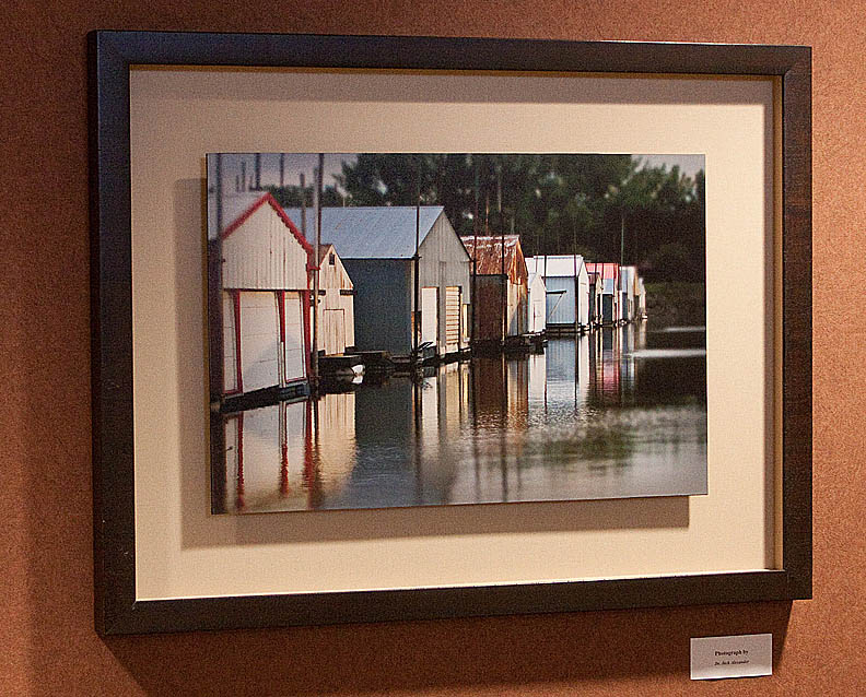
The above Panel Print is 'Red Wing Boathouses' by Dr.
Jack Alexander and is on display at Red Wing Fairview
Hospital.
Visit the new site at RedWingDigital.com.
Please keep arms and legs in the vehicle
Back
in July of this year, there was a blog posting that
discussed the first half of the year and what the
second half of the year looked like (1st
Cutting...).
Now at the end of the year, it seems overwhelming to
look backwards. That being said, the point of this
entry will be all about the forward.
If there is one lesson learned in this business, it
is to trust your gut. If it doesn't feel right, it
probably isn't. And if it does feel right, it
probably is. 2011 feels very right.
The new web site is close (and late) to being rolled
out. Products are being refined and some new projects
are already in the queu. It will be very busy and a
lot of work.
But it is still a labor of love and that is what
really matters.
Thank for your support. We are very grateful for our
customers.
Cartooning...

Tentative
arrangements have been made to host an art exhibit
later this year that will feature the work of
contemporary cartoon artists. Britt Aamodt is a
friend and her book will be released at about the
same time as the exhibit, which is driving this
exhibit. Her book will be available at the Minnesota
Historical Society Press and can be found at this
link.
The intention is to invite several artists, exhibit
some large format cartoons, have a cartooning Q&A
and a book signing in an event spread out over three
venues (Best of Times
Bookstore, The Sheldon
Theatre mezzanine gallery and at our gallery).
You might be asking yourself if cartooning is a
legitimate art medium. It is and I would suggest you
keep the comment to yourself, lest you become the
parodied target of an offended cartoonist.
Therein lies the beauty of cartooning. It can either
lampoon or glamorize their subjects. It can be
humorous or it can be brutally and uncomfortably
frank. It can address real life or it can fabricate
an entirely new universe with it's own laws of
physics. In other words, cartoon art defies
definition.
This exhibit promises to be a lot of fun. I grew up
reading the comics and I still read the comics. I
love the comics.
This is completely consistent with past exhibits,
including the Brown & Bigelow Pin-up exhibit in
2007, the Cream of Wheat original advertising art in
2008 and the original pulp magazine cover art in 2009
(see the illustration trend going here?). Details as
they unfold.
Sheldon Theatre - Holiday Stroll photo booth follow-up
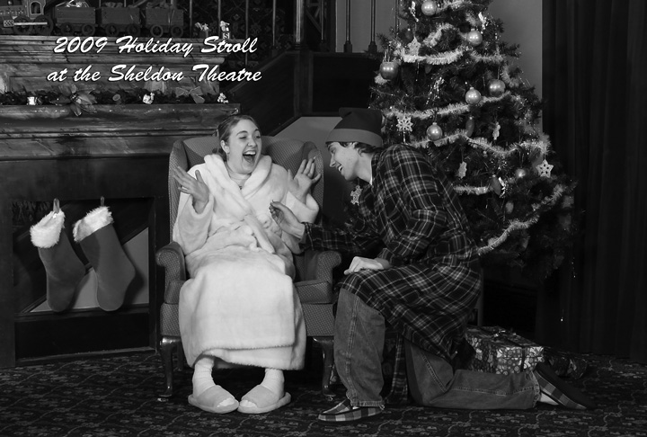
The
fundraiser for the Sheldon Theatre this year was like
last year; exhausting and fun at the same time. The
small army of photography volunteers were a
well-oiled machine of diligence and the clients were
steady all evening. We raised about $500, which is a
30% gain over last year.
The theme was a bit different this year (early
morning Christmas in the 1950's) and the better
images were the ones in which the clients became
engaged in the fun. Above, Matt (my carpenter in real
life) re-creates his proposal to his fiancée.
See? Fun.
Frank the Framer...

Introducing
Frank the Framer. Frank is an interesting persona. To
begin with, he is very friendly and is always smiling
with a warm wink. He cares about his appearance,
judging by the neatly tied bow tie and perfectly
parted hair and he can be both abstract and exact at
the same time and is very colorful.
Over time Frank's purpose will become clear, but
today seemed like a good opportunity to introduce
him.
Old is still the new new...
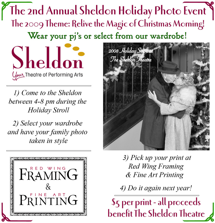
Last year was the first year that we held a fund
raiser for The Sheldon Theatre the Friday after
Thanksgiving. The idea was to open the doors of The
Sheldon to the public during the Downtown Red Wing
Holiday Stroll and use their set and costume
departments to re-create a family photo at a 1950's
Macy's department store.
This year we are excited to work with The Sheldon
again on another retro-Christmas family photo event.
This year we will re-create the excitement of
Christmas morning, circa 1955. To put it in proper
perspective, think of the set of "The Honeymooners"
(Brooklyn apartment, table, chairs and a table-top
tree), throw on an old-fashioned robe (maybe with a
night cap or hair curlers) and a few slippers. The
photos will be printed using a very dated look (back
and white complete with creases).
This will be way too cool for school. And all for
$5.00!
Today was a good day...

This
morning the Minneapolis Star-Tribune business
columnist Dick Youngblood wrote a very favorable
column about our business here in Red Wing. It was a
lot of fun getting to know Dick over several
conversations and meetings and I really didn't know
what to expect. Needless to say, I was very happy and
a bit embarrassed by the attention.
But it was the sub-headline on the second page of the
hard-copy article that really made me smile. For many
years I thought I was a "washed-up sales rep" when in
fact I was only a "burned-out sales rep". Imagine my
relief.
You gotta love it. :)
The article can be found
here.
Thanks for the article Dick and thanks for the
support Dave and Dean.
Panorama-rama

This time of year creates some beautiful
opportunities for panorama photography. The light is
becoming longer and the trees are just beginning to
turn color. The Mississippi River in particular is a
good panorama subject in this area because there are
plenty of river bluffs to capture the wide expanse of
the river.
The photo above was captured at Buena Vista Park
above Alma, Wisconsin. It is a spectacular overlook.
The weather was borderline inclement, which creates
wonderful atmospheres for the camera lens.
This is a 4:1 print. Large format printing is ideal
for a very narrow print like this. In order to really
appreciate a print like this, it does require some
height to the image, which means it will grow very
wide, very fast. A 12" high print becomes a 48" wide
print. Add some mat (typically 3" all around) and
some moulding, the overall image is nearly 5 feet
wide. This is a 'high drama' image that demands
attention as soon as you walk into the room.
New Red Wing Shoe Store and Museum
Red
Wing is a company town and the name of that company
is the Red Wing Shoe Company.
Red Wing Shoe (or 'The Shoe' to the locals) has been
manufacturing shoes and boots in Red Wing for over
100 years. The company manufactures and sells
purpose-built footwear. Some of their target markets
include oil and gas, construction, iron workers,
agriculture, hunting and hiking. Their largest
manufacturing plant is in Red Wing, Minnesota. Almost
all other footwear today is manufactured and imported
from low cost countries, so a work boot made in the
USA is unique.
The Shoe is paternal about the City of Red Wing. When
The Shoe announced last year that they were going to
purchase a blighted downtown building and create a
flagship shoe store and museum, it was a major
announcement, especially locally.
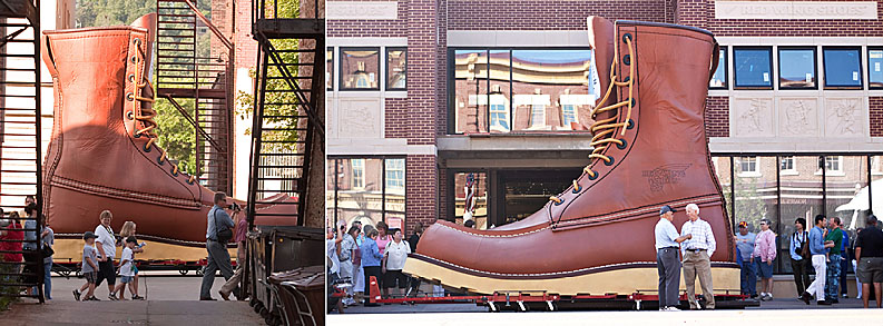
This past week The Shoe moved their World's Largest
Boot (20x a normal boot) from a warehouse to the new
store. It was an exciting event that garnered a lot
of attention. As exciting as that was, the energy
level is even higher inside the store as employees
scramble to meet an aggressive deadline in opening
the new store.
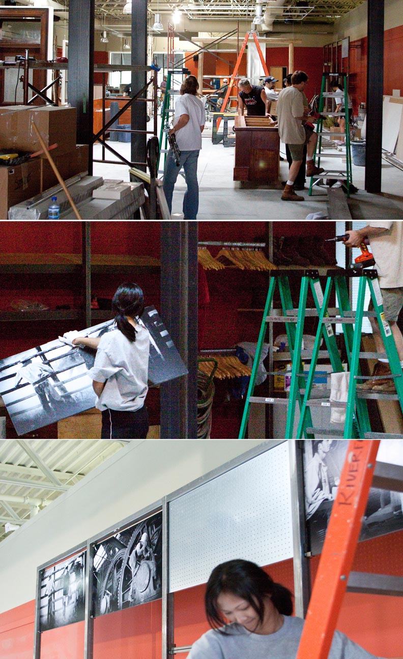
Red Wing Shoe understands the value of visuals and is
an image-oriented company. We are proud to have
provided the graphics and framing for this exciting
new venue. The store opens August 3rd and the museum
later this month.
New name - new web site - new challenges
People
who invent snappy metaphors to describe business
principles might say something like; a small business
today is like a great white shark, always on the
move, never resting, never sleeping. That sounds way
too contrived, so it would be best to simply say that
a business must constantly ask itself what it does
for a living, and is it where it wants to be in doing
that thing it does.
The name change is more a matter of acknowledging how
this business has evolved. We frame and we print and
we do anything in between. Also it was time to
freshen up the logo; shine our shoes, so to speak.
This was harder than you might think because the
fonts used are fabricated for our needs. It isn't an
off-the-shelf font, but it does have a basis in the
history of this business. But it is too difficult to
explain without hand gestures.
The new web site is another matter. The changes
appear to be mostly cosmetic, but under the hood it
is an entirely different animal. It would take a
rocket scientist to explain the differences and
unfortunately, one isn't immediately availible.
With any new web site, it is very easy to be driven
crazy trying to chase down every image resizing
requirement or some dropped html code. This is called
'overhead' and produces no income. Overhead bad.
Income good.
But, you do what you have to do, when you have to do
it.
The Red Wing Framing Gallery Panel Print
And now, a word from the sponsor...
For years, people have been complaining that, "if they can put a man on the moon, why can't they put a print on a panel?"
Introducing the Red Wing Framing Gallery Panel Print.
It's a Panel! It's a Print!
It's a Panel Print!
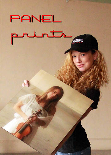
It begins with any digital photo
and ends with a full-print bleed, UV-protected, 1/4"
thick hardboard panel print that is
pool-table
flat and rugged!
The Panel Print has a linen laminate finish and a 1"
reverse frame mount. The mount lays flat on the wall
and the print is an elevated surface that creates a
modern 'drop-shadow' effect on the wall.
It can be printed at any size or aspect ratio (great
for panorama photographs) and it has been especially
popular with photographers who appreciate this very
contemporary look. It also works great for commercial
projects that are restricted from using glass or need
to cover large wall surfaces, yet still need to
project elegance and creativity.
Call the shop today at 1-651-385-0500 and create your
own art from your own images!
Now, back to the regularly scheduled programming.
The Big Picture

Clare
Baker called last November for an interview for The
Big Picture magazine, which is a trade journal for
the wide-format printing industry. The gist of the
article is about printers who have carved out a niche
business of providing wide-format, fine-art printing.
Wide-format printing is anything larger than 44" and
fine-art printing is usually defined as low-volume,
high-mix printing with tight duplication standards.
Over a period of weeks, Clare and I would
occasionally talk, but I lost track of the
publication date. I was pleasantly surprised to
receive the article in my mailbox this week. Clare
did her homework and did a terrific job of detailing
the priorities in wide-format fine-art printing:
1) Invest in capture, calibration and proofing
technologies.
2) Push the envelope in new applications and learn
from the failures.
An electronic version is right
here.
Hometime...yet again (ver. 2009)...
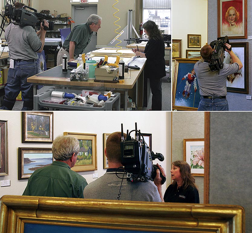
The
Hometime episode we were involved with last year is
being re-broadcast over the next several weeks,
beginning this past Saturday (01-24-09). Locally it
will be shown on Saturday. February 14, 2009 at 5:30
pm (TPT, channel 2).
What a terrific opportunity this has been for us and
I am thankful for being so fortunate. We have met
many people and we had a blast being involved.
One of the more interesting aspects for me was the
challenge from an operational standpoint. Extremely
tight (and rigid) deadlines and having to essentially
close the shop for two days to conduct filming. If I
remember right, it was six, 18-hour days in a row.
There was a flub or two (or three) along the way, but
nothing that couldn't be fixed (or reprinted).
The web traffic has been significantly heavier this
year. I think it is because Hometime has a much
better schedule this year on PBS (they typically
block it right before "This Old House") and the
search engines have had a full year to digest and
sort relevant inquiries, consequently the search
listings are more favorable.
For those so inclined to see the episode, here is the
segment:
Beauty and the beast...
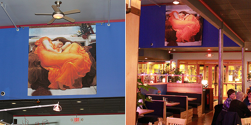
A
contrast in projects.
Beauty:
The first project is for the new Norton's Downtown
and Lucky Cat Lounge. This restaurant-lounge-fine
wine store has some very large and high walls and it
needed a tasteful image that befits the atmosphere of
this white linen restaurant.
The image used is
The Flaming June and
was selected for
its gracefulness, color and image impact. It is one
of the first things you see when you enter the
restaurant from the parking lot and walk towards the
hostess station.
The final image size is 8' x 8' and it is printed on
a satin fabric with an unfinished and unweighed
bottom edge. Because of the 'hand' and drape-ability
of the fabric used, the entire image has a beautiful
waft to it as it moves with the air circulation,
almost as if it were breathing.
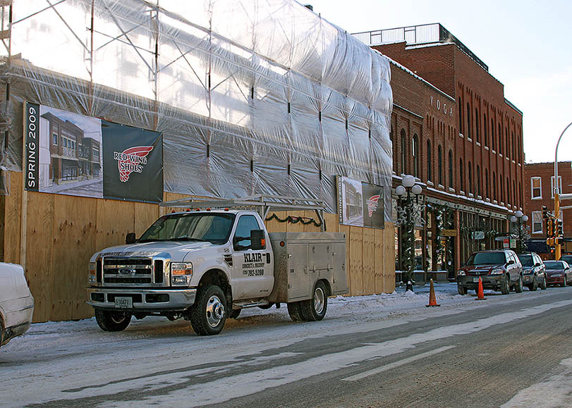
Beast:
Right next door to Norton's restaurant, the new Red
Wing Shoe Company store is being built. This store
will be a showcase for The Shoe, which has their
world headquarters directly across the street. Red
Wing Shoes are simply the best made boots and shoes
in the world. I wear my Model 414 boots for nine
months out the year and I personally vouch for the
high quality and ruggedness of their products.
This project is labeled the beast because of the
conditions that these images have to
tolerate...beastly. The weather was -15 F with snow
and high winds when they were installed. The
construction wall is literally 6 inches from Highway
61 and the images have to tolerate heavy truck
traffic, rocks, dirt, grime and salt. And, of course
the weather extremes.
Each image (there are two) is 6' x 15'. It is a
reprint of the architectural concept drawing, with an
opening date and The Shoe logo. A heavy-duty scrim
material was deployed and it was further re-enforced
with the thickest laminate available. The edges were
treated with a super glue-like adhesive and 1/2"
weather resistant, re-inforced nickel grommets were
used every 2.5 feet.
Too much fun.
Old is the new new
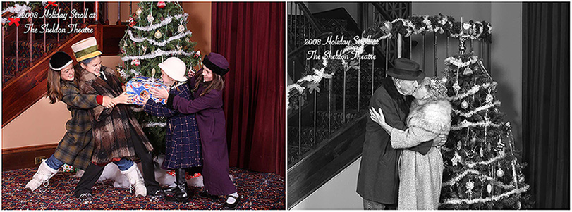
Last
night was the 7th annual Red Wing Holiday Stroll.
This event is hosted by the Downtown Red Wing
Mainstreet organization and is meant to be an
alternative to the enclosed mall exodus that
typically occurs the day after Thanksgiving.
Anybody downtown can pretty much define whatever
activity they want to do during the stroll and many
merchants provide discounts and free snacks. We opted
to work with The Sheldon Theatre to create a fun
family event that is both corny and nostalgic.
It was decided to re-create an Eisenhower-era
tradition…the family Christmas photo.
We settled on a fakey outdoor-looking Christmas photo
set, obviously taken indoors, very much like you
might find at a Macy’s Department Store in 1955. This
allowed us to use period overcoats, hats and fake
snow to re-create the era and move clients in and out
of the set quickly. 15 minutes later they would stop
by our shop to pick up a keepsake 5”x7” photo,
printed in period fashion and in a stylish envelope.
Most clients ‘got it’ and really became involved in
the spirit of the event.
All for $5 and all the proceeds went to the Friends
of The Sheldon, which is the fund raising arm of The
Sheldon.
A small army of volunteers was recruited and it was a
mostly-smooth workflow of production. There were a
lot of laughs and there are too many people to thank
here that made this work. Ideas are already brewing
for next year.
Good times.
The fine art of fine art printing...

Fine art printing is one of my favorite aspects of this business.
Printing is a nuanced science. By this, I mean that printing can be defined in technical terms, but it is the final perception by the viewer that defines the print impact.
But it isn't rocket science and it isn't brain surgery.
The first thing a fine-art print shop needs to accomplish is having all of the devices interpret color the same. This is a closed loop calibration and this normalizes the environment. Outside the loop, colors might shift, unless the device outside the loop is given the same calibration specifications. Color calibration does require regular re-calibration because of temperature and humidity changes.
That solves the issue of repeatability. The next step is accuracy.
Accuracy requires understanding the personality of the devices and the media. Every media has unique characteristics. We create about 1200 color patches for each media we use. These patches are read back into the computer with a photospectometer (a device that reads color) and a compensation file is created based on the expected versus the actual color values. This color profile is used by the printer to compensate for any color shifts.
However, there is an infinite number of color frequencies between each of the 1200 patches and this is where the media personalities comes into play. Does the media like blue frequencies? How well does it contrast? How bright is the base material? Stuff like that.
Fine-art printing can be somewhat iterative, but it isn't 'black magic'. I smile every-time I hear a printer try to make the process sound so mysterious.
So anyway, lot's of variables and each project is unique.
Good times and Save the Chief.
The move, Hometime summary and other business related stuff
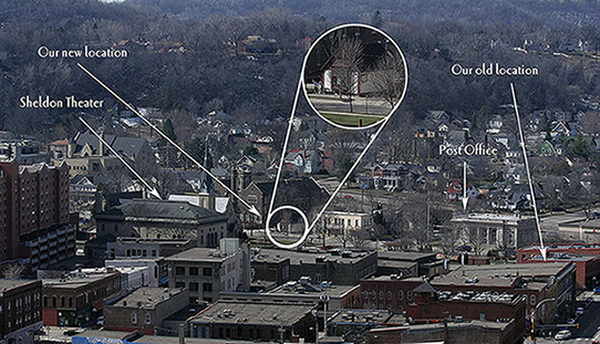
This will be a meek effort to try and become current in a single entry.
The move. Or maybe I should say, The Move. It somehow needs that kind of impact to share what it was like.
I have this bad habit of assuming that if I live long enough (+200 years at this point), I will find a use or a purpose for nearly everything. Consequently, I don't throw much out. This is fine if you have the space to stash all of this crap (for lack of a better term), but if you are moving into a space that requires storage discipline, life can quickly get kind of, um, stressful.
The bottom line is we are moved, the new space is awesome (photos forthcoming) and I think my thumbs are only sprained and not broken. I am still renting half of my old space (saw room, portrait studio and more stashed crap), which is my way of not throwing stuff out.
The photo above was taken last Sunday from Barn Bluff. This gives you an idea of where we are located amongst the other buildings in Red Wing. The people waving in the inset (squint very hard) is the Missus and my older brother (who is one year older today).
Hometime summary. 'Amazing' seems like an appropriate adjective.
The Hometime show was originally broadcast a month ago and is usually shown at different PBS affiliates around the US every Saturday or Sunday, moving from East Coast to West Coast. I think some of the major markets in California will broadcast this weekend.
We have made a lot of new friends from all over the country and the added business has been very nice. I feel very fortunate to have had this level of visibility and there are a number of interesting opportunities and partnerships that have emerged from the Hometime project. I should have something more concrete to share soon. Good stuff.
I want to thank Dean Johnson and his entire crew for thinking of us.
Other business related stuff. We are completely up and operational in the new location. We are still straddling two locations, so that requires a bit more forethought and planning. The new neighborhood is terrific; much more jogger and baby-buggy friendly. The intention will be to use the outside of the building itself as a gallery. This will make more sense when we do it, rather than try to explain it.
And finally, a video study group is forming in Red Wing, with the eventual goal of showing independent video projects. The AV Club of Red Wing. Every member will be required to have white tape on the bridge of his or her glasses. E-mail me if you need more information, but in the meantime, "Save the Chief".
Hometime, part deux (ver. 2008)

It has been interesting tracking the feedback from the Hometime show. The show was released to the PBS affiliates last weekend and each affiliate creates their own schedule. In any case, over time most of the PBS affiliates broadcast the show and this slow 'unrolling' allows me to watch the traffic patterns.
We only track trends and do not spend too much time drilling down into the 'Rabbit Hole' of data out in the virtual world. So far, Tennessee, Ohio and Maine have been especially active with follow-up from either the PBS.org or Hometime.com web sites. Since Saturday our web traffic is about 3x the normal volume and the typical visitor is spending about 4x the average time looking around the web site. This means the overall visit quality is increasing, which is a good thing.
Locally, the show will air this coming Saturday. The Red Wing paper did a terrific feature on the show last weekend, so that should raise local awareness as well.
Hometime
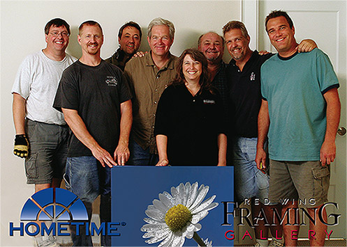
Recap; The PBS television show Hometime came to our shop last year to film an episode. This episode is part of a season-long project of completely building out a luxury town home and our job was to scan, print, stretch and install custom designed art. Hometime has been broadcast nationwide for 22 years and has a very loyal following.
It wasn't until the last month that we received final confirmation of the Hometime episode that we participated in. PBS has kind of a funky way of doing things in regards to schedules. PBS does not have the same kind of competitive pressures as the other networks, so they allow the local affiliates to pretty much schedule at will and around any fund raising activities they might have going on.
So, the bottom line is that our episdoe (#2206, Town home: Finale) will be broadcast nationwide on March 8th and in the Red Wing area (TPT, Channel 2) on March 15th at 9 am.
What can we expect? I have no idea. Hometime is carried by 240 PBS stations and is broadcast 340 times per week. The typical episode is seen by about 1 million households and 1.2 million viewers.
Bill Gibb was the producer/director for our episode and Bill told me that it typically takes 8 hours of filmed tape to produce 8 minutes of on-air footage. I saw our episode and there is about 7 minutes of dedicated air-time in discussing our portion and through most of the show you can see the art in the background. One of the best parts for me was the shots taken of the Red Wing community at large. Bill followed-up a suggestion to take some footage from Memorial Park and got some terrific footage of Downtown Red Wing.
I have several tools in place to try and measure what kind of impact the show will have and I promise to share as the results unfold.

