
2014 Flyway Film Festival
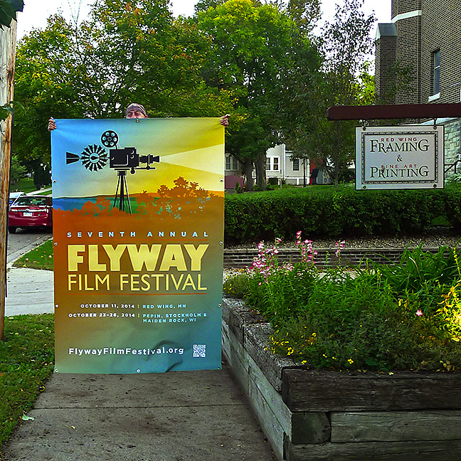
Every year we take this photo because every year we
like to be involved in the Flyway Film
Festival.
This year the Festival will continue to grow and we
are delighted to be a small part of it.
2013 Flyway Film Festival
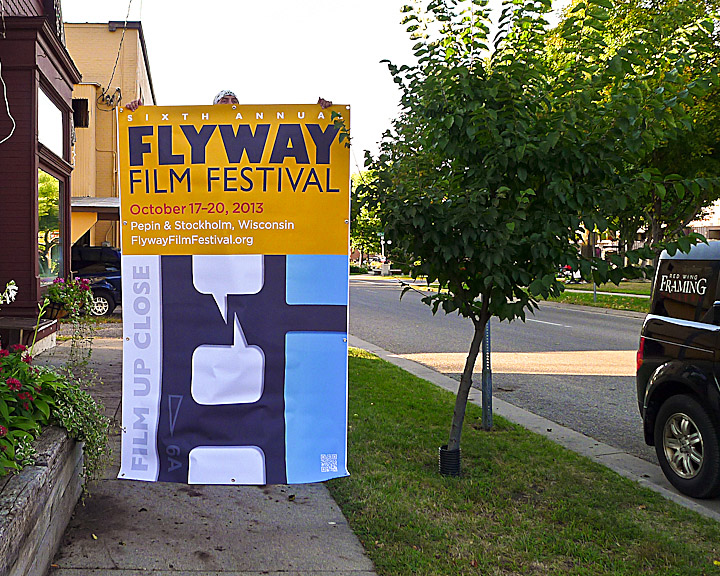
The Flyway Film
Festival is still one of our favorite events each
year. Each year it continues to improve and this year
will be no exception.
We love to participate because we love
films.
2011 Flyway Film Festival
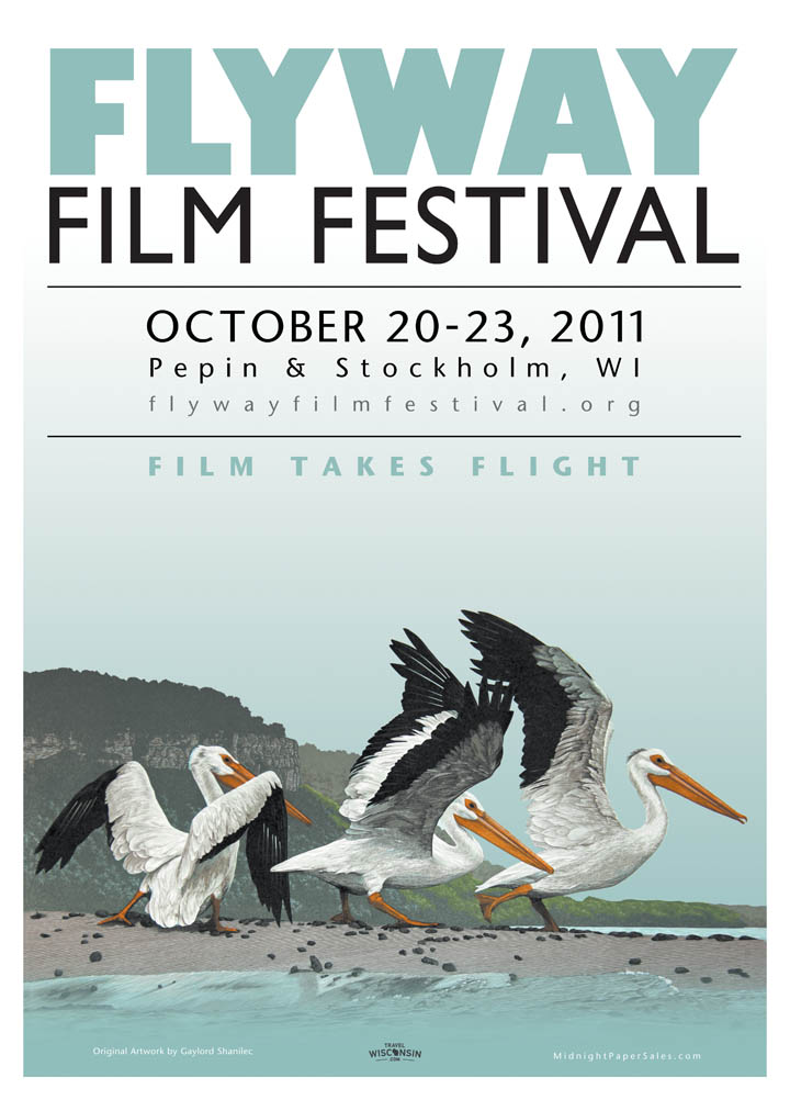
The
Flyway
Film Festival is one of our favorite events each
year. It is an uninhibited creative endeavor over
three days in October. Each year it has grown in size
and scale and this year promises to be especially
exciting.
First, the Flyway Film folks received a generous
grant from the Wisconsin Department of Tourism that
will really boost marketing efforts. This extra money
will be used to widen the circle of marketing.
Second, the festival graphic is noteworthy for the
artist. Gaylord Shanilec created the original etching
of the three pelicans that are used in the poster.
Gaylord is unquestionably talented, pelicans are
indigenous to this area and it is just an exceptional
image of this region. Totally appropriate.
And finally, a very limited edition of signed
fine-art are available for purchase, which will be
used to help fund the festival. We printed the
limited edition prints on a Hahnemuehle textured 100%
cotton paper that should last for hundreds of years.
October 23-25. Can't wait.
2010 Flyway Film Festival
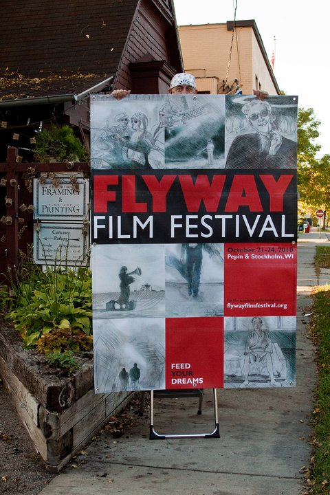
Once
again we are delighted to be a red carpet sponsor of
Flyway Film Festival. This event is in its third year
and is really beginning to collect some traction. The
quality of the movies this year is very impressive.
The Festival begins on Thursday, October 21 with a
gala event in which the sponsors, directors, actors
and organizers get together, nibble on snacks, drink
some wine and have creative discussions. At the end
of the evening there will be an awards ceremony.
The films begin on Friday, October 22 with the
screening of "Baraboo",
which sounds like a very interesting
film
about life and the hand we are dealt. Over the course
of the weekend, 21 films will be screened.
Details
are at www.FlywayFilmFestival.org.
See you in Stockholm in two weeks!
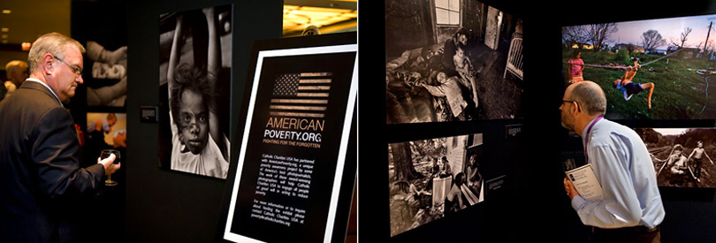
AmericanPoverty.com and Catholic Charities USA wrap-up...
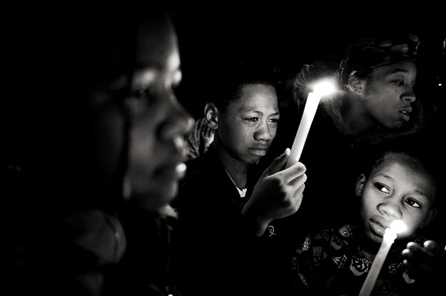
This
week marks the final chapter of the poverty awareness
photojournalism exhibit entitled "In our own
backyard". This exhibit has crisscrossed the United
States for the past 18 months and next week the
exhibit finishes in Washington DC at the annual
Leadership Summit for Catholic Charities.
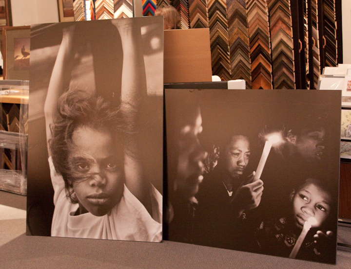
Since this is the final and highest profile stop of
the tour, all of the large format images are being
reprinted and remounted, which is close to 120
images.
It is a very moving set of images, that address all
manners of poverty and everyday life. It is really
hard not to stop and soak up the texture and realism
of each image.
This has been a challenging and gratifying project.
One of the best parts of this project has been
working with Steve Liss. He is a natural-born
educator and an amazing photojournalist who gets
right into the thick of it. Please visit his web site
at: SteveLiss.com.
Russell Patterson, 1893 - 1977
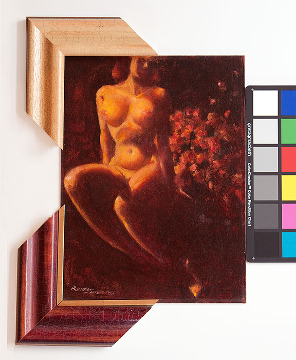
Half of the fun of framing (and it is very fun) is
researching the art. This was a piece that was
recently acquired in an art auction and this artist
merits the research.
The piece is entitled "Nude & Flowers" from 1964
and painted by Russell Patterson. It is 12"x16" and
it is an oil on hardboard.
Patterson
was a fascinating personality who lived from 1893 to
1977. He began his career as a magazine illustrator
working for Vogue, Vanity Fair, Cosmopolitan and
Redbook. During this period he achieved celebrity
status as an illustrator of beautiful women.
In the early 1930's he became restless and decided to
become a Broadway costume designer for several
successful Broadway productions. By the end of the
1930's he had moved to Hollywood to work on scene and
costume design.
Again he became restless and developed a comic strip
called 'Mamie', which became a Sunday syndicated
cartoon that ran for six years. The Mamie character
was glamorously portrayed, which leveraged his
artistic talent and his sense of fashion.
By the 1960's he reverted back to being a fine art
artist, but was not above exploiting his celebrity
status by being a judge for Miss America and Miss
Universe pageants and endorsing Medaglia D'Oro coffee
and Lord Calvert whiskey.
Patterson was a renaissance man who grew up in the
public eye. He enjoyed new challenges and he
especially enjoyed his high profile status in the
media.
Now the challenge becomes how to best frame this
original that does this artist justice.
Cartooning...
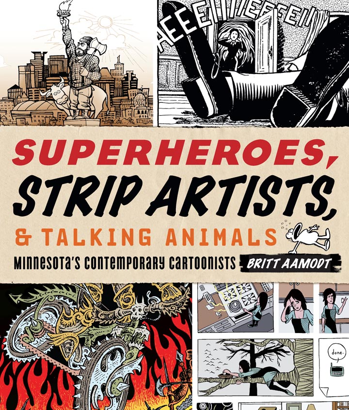
Tentative
arrangements have been made to host an art exhibit
later this year that will feature the work of
contemporary cartoon artists. Britt Aamodt is a
friend and her book will be released at about the
same time as the exhibit, which is driving this
exhibit. Her book will be available at the Minnesota
Historical Society Press and can be found at this
link.
The intention is to invite several artists, exhibit
some large format cartoons, have a cartooning Q&A
and a book signing in an event spread out over three
venues (Best of Times
Bookstore, The Sheldon
Theatre mezzanine gallery and at our gallery).
You might be asking yourself if cartooning is a
legitimate art medium. It is and I would suggest you
keep the comment to yourself, lest you become the
parodied target of an offended cartoonist.
Therein lies the beauty of cartooning. It can either
lampoon or glamorize their subjects. It can be
humorous or it can be brutally and uncomfortably
frank. It can address real life or it can fabricate
an entirely new universe with it's own laws of
physics. In other words, cartoon art defies
definition.
This exhibit promises to be a lot of fun. I grew up
reading the comics and I still read the comics. I
love the comics.
This is completely consistent with past exhibits,
including the Brown & Bigelow Pin-up exhibit in
2007, the Cream of Wheat original advertising art in
2008 and the original pulp magazine cover art in 2009
(see the illustration trend going here?). Details as
they unfold.
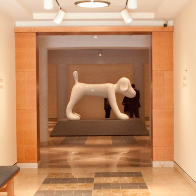
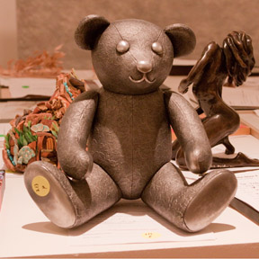
Yoshitomo Nara
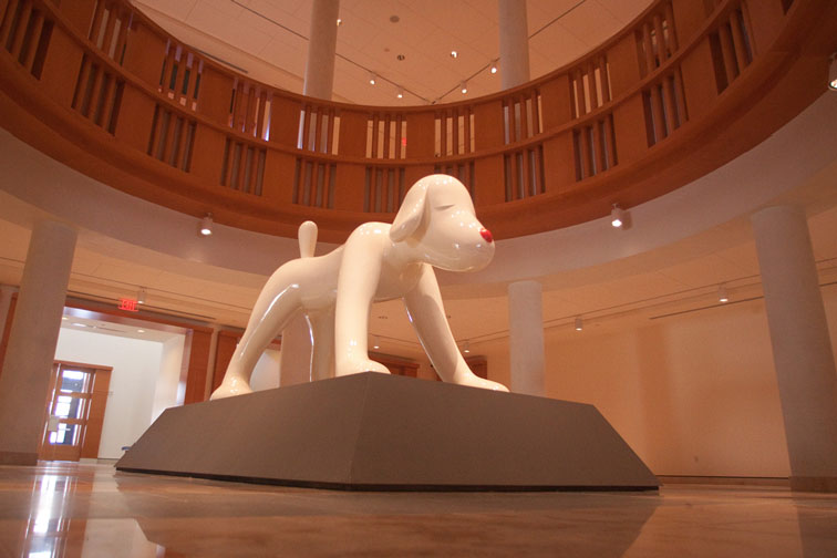
Yoshitomo Nara is a 51 year old Japanese pop artist
that has been influenced by anime and punk
rock. His sculptures seem cartoonish in nature
and are typically animals or children. Very
often his subjects will have contradictory elements
such as weapons or accusatory looks that belie their
wide-eyed expressions.
The
interesting thing about Nara is his
consistency. Artists like Nara have this
pursuit of the same relentless vision regardless of
the critics. Nara says he is helpless in this
matter because he is compelled to create
them.
This
fiberglass sculpture is called “Your Dog” and is part
of the permanent collection at the Minneapolis
Institute of Arts.
The traveling photojournalism exhibit
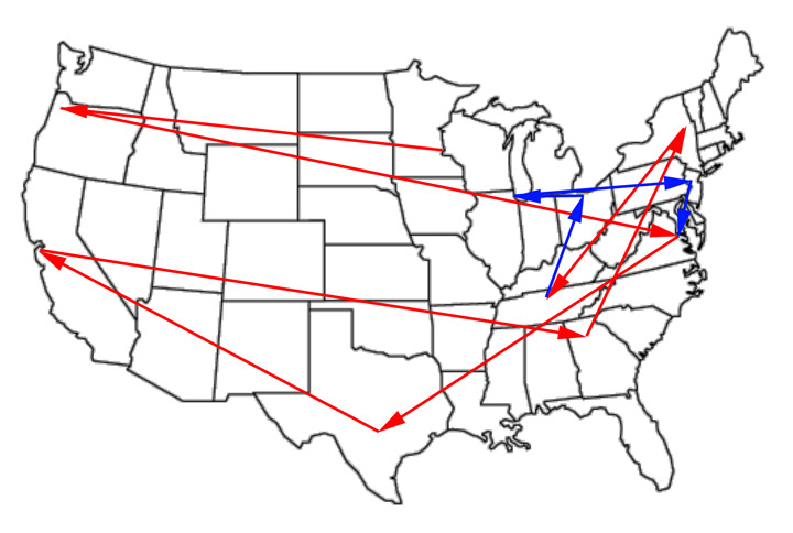
It
has been a full year since we became involved in the
Catholic Charities American Poverty photojournalism
project. It has been a rewarding and challenging year
and now a certain rhythm takes place as the exhibit
crisscrosses the United States. This coming week the
exhibit presents itself in Nashville, Tennessee. The
map above demonstrates where the exhibit has traveled
(in red) and where it is yet to travel (in blue).
Additional cites might still be added and no final
confirmation yet if the final exhibit will take place
at the White House.
Steve Liss is the Project Director and will travel to
each city immediately prior to the exhibit reception
and artfully and tastefully documents the slices of
poverty unique to each community. Our job becomes
image preparation (printing, mounting and packaging)
all of the images for each exhibit and delivering
them directly to the exhibit venue. Usually there
isn't a single day to spare and thankfully UPS has
delivered each and every package on time and in
perfect condition. Ideally there would be a larger
buffer of time for production, but then, what would
be the challenge in that?
It is a challenge and from every challenge you hope
you learn and improve from the experience. The
official web
site is worth a visit. It is very well
done.
Put up or shut up!
Over
the years and after working with countless artists,
it is easy to forget what an artist really goes
through when they exhibit their art. They open
themselves up for critical review and there is
significant exposure on the part of the artist. They
might be appear to be nonchalant or even
over-confident about exhibiting, but inside their
stomach acids are working overtime. For me, it was
time to put up or shut up.
The 'Foot in the Door' exhibit is different in this
regard. It is completely democratic, because if it
fits in the box, it exhibits. Consequently, it
becomes much less about the art and more about just
being able to exhibit and have fun. I submitted a
photograph I took ten years ago. it is entitled
"Midnight on Mason Street". It was taken in San
Francisco and the image exposure was on the neon leg.
This severely underexposed the rest of the image and
you are left with these two illuminated signs on
opposite sides of the street. It is a gimmick photo,
but I am partial to gimmicks. I was raised on comic
books and my favorite part was always the
Johnson-Smith page on the inside back cover (x-ray
glasses and such). The clearinghouse of gimmicks.
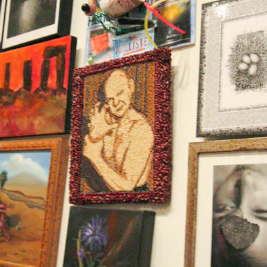
My favorite image from the exhibit has to be the seed
art tribute to wrestler Baron von Raschke. Classic.
More about 'Foot in the Door 4'
I
love the Minneapolis Institute of Arts. I know that
is not a profound observation for anybody who has
ever visited the MIA, because anybody who has ever
visited it, also falls in love with it. It is a
friendly and welcoming arts atmosphere (which isn't
as common as you would hope), the art is terrific and
it is free. What's not to love?
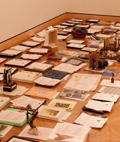
Be that as it may, the 'Foot in the Door 4' is
shaping up nicely. I had the chance to visit a second
time before the public unveiling. The total
submissions were beyond all estimates and the lines
were long for nearly the entire four day submission
period. The final number is a closely guarded secret
until the public reception, but sources close to the
count have provided a range of between 4,700 and
5,000 entries (compared to 1,700 submissions ten
years ago, the last time this exhibit took place).
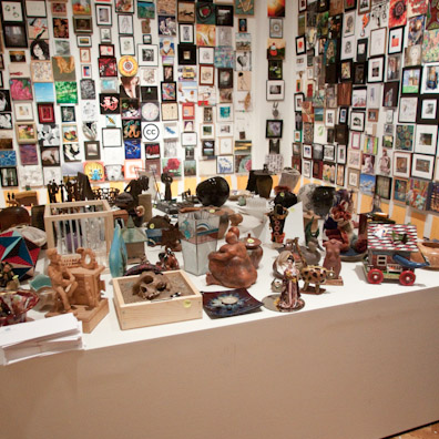
Three large gallery rooms will be filled and the raw
expression of creativity is almost overwhelming.
I managed to find my piece and two of the three
pieces I had submitted on behalf of friends and
offspring. It looked as if about half the art was up
and I did hear that all of the art had been
photographed for the online gallery.
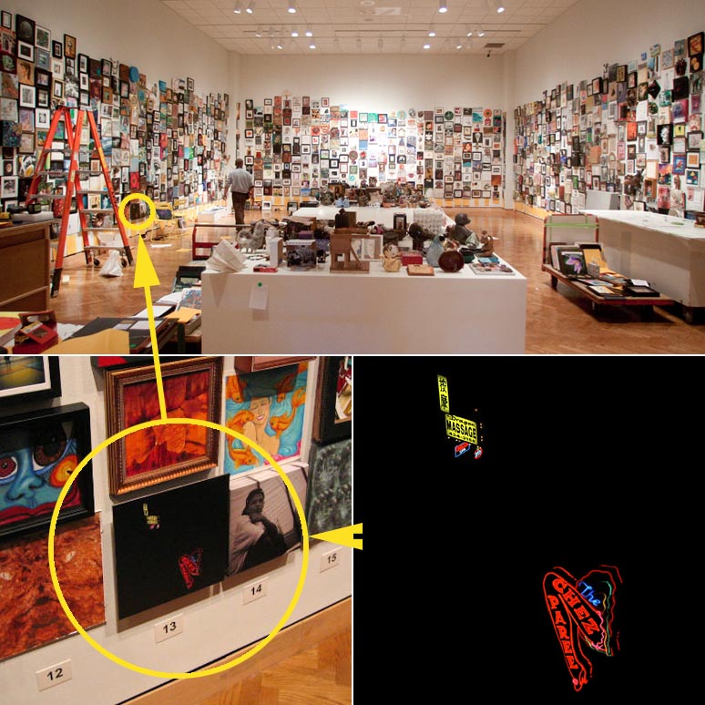
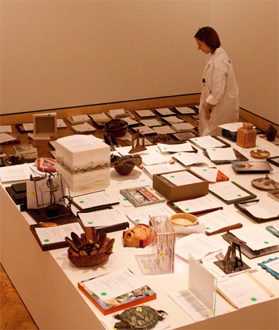
Behind the scenes of 'Foot in the Door 4'
This
job provides for a couple of perks, one of which is
being involved in interesting art exhibit projects
from a 'behind the scenes' perspective. In other
words, friends in the art world ask you to volunteer
to help them with an event. Yesterday was a perfect
example.
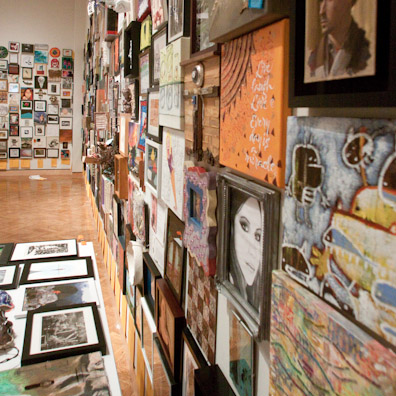
Every 10 years (this being the fourth time), The
Minneapolis Institute of Arts hosts an event called
the "Foot in the Door" exhibit. Essentially, any
Minnesota resident, at no expense to themselves, can
submit one original piece of art they have created to
be exhibited at The Minneapolis Institute of Arts.
The art cannot be larger than 12"x12" for wall art or
larger than 12"x12"x12" for three dimensional art. It
is a terrific opportunity to exhibit in one of the
most prestigious museums in the world for four
months.
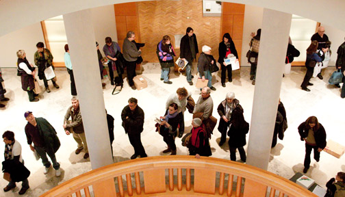
Art check-in takes place over four days. As a
volunteer for the art check-in, my responsibilities
were 1) insure the art did not violate the size rule,
2) collect the paperwork for each piece, 3) assign a
wall location, 4) provide a receipt for the art and
then 5) deliver the art to the staging area. In other
words, the first point of contact for the artists.
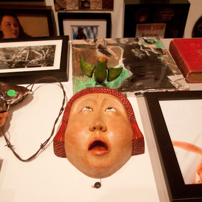
The art itself was impressive and the range was
amazing. Each piece was cradled by the artists as if
it were a newborn.
After the art is received, it is staged in an exhibit
room and waits to be registered in the computer and
photographed for the on-line catalogue. Over 1,000
artists checked in art the first day and over 3,000
submissions are expected. At the peak crowd size, the
wait was 2.5 hours, but everybody was extremely
patient and in a very good mood.
One of the other perks in volunteering is checking in
your own art (and your friend's art) without the
complication of waiting in line. Those will be posted
later.
Today my back is killing me (marble floors) and I am
exhausted. It cost me a day's pay to be there and the
tuna sandwich was stale when I finally had a chance
to eat. But I made many new friends and saw many
familiar friends and would do it again in a New York
minute. I can't wait for the exhibit reception which
is on February 18, 2010.
A good gig
January
is usually a quiet month in the art and framing
industry. There might be a small bump in business
because of some Christmas follow-up framing, but that
trickles away pretty quickly.
This January was an exception. Several projects came
in the door because of fiscal calendar years that
started January 1st. Another major Catholic Charities
project was delivered, this time for a Centennial
Leadership Summit in San Jose, CA. This was the
largest venue so far (this being the 4th) and it will
move across the United States every month until
September, where hopefully it will exhibit at the
White House. Go to
www.AmericanPoverty.org to get the most current
updates. I love working on this project because it
leverages the power of photography and it is an
absolute adrenaline rush in meeting the tight
deadlines. In this business, this is known as a 'good
gig'.
We also had our first order from Turkmenistan. To be
more precise; Ashgabat, Turkmenistan. This is a
former Soviet Union republic that declared
independence in 1991. It was a nice sized order of 10
large format mounted images and one extremely large
canvas print. There is a sense of satisfaction in
knowing your handiwork is on the job in some remote
part of the world.
On an unrelated note; Downtown Mainstreet agreed to
co-sponsor a photography competition with Red Wing
Framing & Fine Art Printing. It is always fun to
have too much to do.
And finally, if nothing else I learned a long time
ago to surround yourself with very smart people. Or
at least stand close to them.
I am uber-excited about a new project that some very
smart people I have come to know are advising me on.
This is on a six-month timetable, so the details will
roll out over time.
Next stop: The Newseum
The Newseum is
an interactive museum of news and journalism in
Washington D.C. The mission of The Newseum (from
their web site) is to "educate the public about the
value of a free press in a free society and tells the
stories of the world's important events in unique and
engaging ways". In other words, it is all about the
First Amendment. It is located just off Pennsylvania
Avenue near The U.S. Capital. This is a high profile
location in a high profile city.
As part of our ongoing relationship with the
AmericanPoverty.org photojournalism
exhibit, we produced several very large (48”x72”)
mounted prints for a reception at the Newseum later
this week. The images needed to be large because the
reception hall is large and visual impact is
important. This is an exhibit designed to create
momentum for the AmericanPoverty.org campaign going
forward.
These images have this beautiful platinum print
finish. Platinum prints (sometimes called
platinotypes) is one of the oldest photographic
processing techniques and provides the greatest tonal
range of any printing method using wet chemistry
development. But because this is the digital age,
platinum prints are ‘replicated’ in the computer, yet
they do a terrific job of re-creating the original
look.
2010 will see an acceleration of activity with
Catholic Charities and AmericanPoverty.org.
And we can hardly wait.
Hard Boiled Art exhibit...
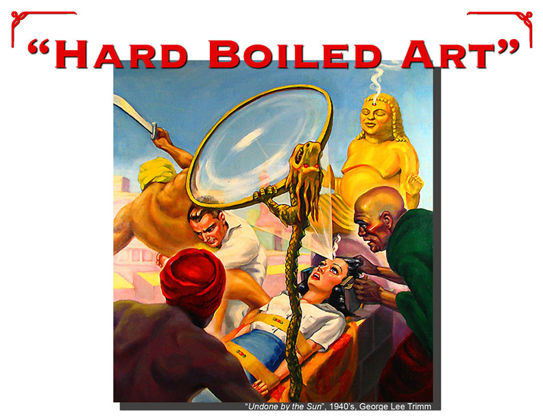
Details have been finalized for our next original art
exhibit. "Hard Boiled Art" presents original pulp
magazine cover art from the 1930's to the 1960's. The
exhibit will run from November 5th to December 6th,
2009 with a reception that is still to be determined.
This is a unique art form. Pulp magazine covers were
very sensational and were considered the most
important aspect in the sales of any particular pulp
series. The socially acceptable boundaries were often
tested and the topics reflected the then current
popular culture.
The covers were typically machismo in nature with
elements of evil or danger and at least one hero. The
1930's had strong detective and science-fiction
followings and the 1960's were all about the 'Red
Scare' of the communists.
Regardless of the threat, the damsels in distress
typically had a torn blouse. :)
Come and enjoy the exhibit. This is a rare
opportunity to see the original art that was used to
create the published covers. It is fun and an
absolute snapshot of an industry that hardly exists
any longer.
Flyway Film Festival countdown...
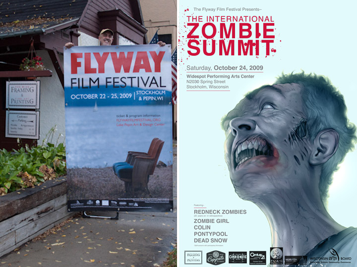
This
weekend is the much anticipated 2nd annual Flyway
Film Festival. The event begins on Thursday night
with a meet-and-greet reception and the opening night
of movies begins on Friday night with
"Storm",
followed by
"Ink". In
many cases both actors and the directors of the films
will be at the film festival to answer questions and
over the course of Friday, Saturday and Sunday over
30 independent films will be shown.
Saturday will be a bit different with a one-day,
genre-specific event of classic and cutting-edge
independent zombie films. And everybody loves a good
movie about the undead :)
We are proud to be a red carpet sponsor of this
ambitious art endeavor and to have provided the large
format graphics to promote this event.
Details are at www.FlywayFilmFestival.org.
See you in Stockholm this weekend!
AmericanPoverty.org
Last week Catholic Charities USA kicked off their
annual conference in Portland, Oregon with the large
format photojournalism exhibit produced by the
In Our Own Backyard photojournalism
team.
This
exhibit was entitled AmericanPoverty.org
and is meant to raise the awareness of people living
in poverty in the United States. Catholic Charities
has declared the goal to reduce poverty in the United
States by 50 percent by the year 2020. This is a very
aggressive goal, but Catholic Charities understands
that the only way to meet an aggressive goal is to
set the bar very high.
In
Our Own Backyard is
a team of skilled and seasoned
photojournalists who
have witnessed first-hand the struggles of extreme
poverty in the United States. This team includes, in
part, Steve Liss, Jon Lowenstein, Brenda Ann
Kenneally and Eli Reed. These are talented
photojournalists, with strong personalities and
stronger communication skills. They have crisscrossed
the United States in capturing exactly what it means
to be poor.
It has been a delight to be involved in this project.
The deadlines were tight and God bless overnight
delivery. There are a minimum of six more cities that
will be hosting this exhibit over the next year, so
we look forward to future involvement. Learn more
about this large format photojournalism project at
AmericanPoverty.org.
Flyway Film Festival sponsorship
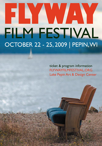
We are super excited.
This year Red Wing Framing & Fine Art Printing
will be a 'Red Carpet Sponsor' of the 2nd annual
Flyway Film Festival in Pepin, Wisconsin from October
22 to 25, 2009. The primary venue will be the Lake
Pepin Art & Design Center. Besides providing
support in part for the entire event, we will be the
presenting sponsor for the opening night events on
Friday night, October 23rd at 7 pm.
This is a significant investment for our modest
operation, but it makes sense for several reasons;
1) We like what this group is trying to accomplish
and their ambitious way of going about it.
2) We love films, which should be apparent by past
entries regarding the Chief Theater in Red Wing.
3) We feel it is very important to contribute to the
community and we like art venues that try to be
all-inclusive.
More about this as the calendar gets closer to the
the film festival.
Pulp cover art...
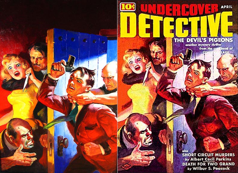
Pulp cover art has a unique place in art history. It
has terrific nostalgia appeal for anybody who enjoyed
The Hardy Boys, comic books or even a peek at The Old
Man's collection of True Detective or Stag magazines.
It had the specific purposes to grab your attention
on the newstand in a crowded field of competitor's
and to evoke an emotion, usually with a provocative
image of impending peril or suggestive sensuality.
Common elements usually include a couple of 'toughs',
a large breasted woman and a 'citizen' or a 'hero'.
The above example (original on the left, Rudolph
Zirn, 1939) has all three.
We are excited and delighted to announce a gallery
exhibit of original pulp cover art. The show will
open in October (date tbd) and will include both the
original art and the subsequent ephemera the
originals were used to produce. The colors are
extremely vivid and the techniques used by the
artists to project a response is fascinating.
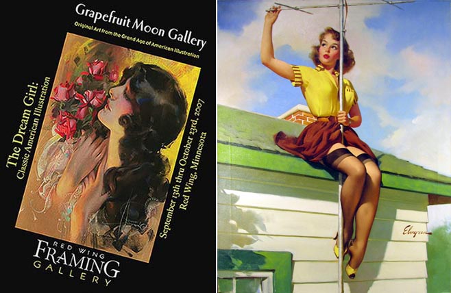
This is the third year in a row that we have had the
pleasure of working with Grapefruit
Moon Gallery in presenting their collection of
illustration art. In 2007 we presented original
pin-up art (here
and
here) and in 2008 we presented original
Cream of Wheat advertising art. Pulp magazine art
is yet another sub-genre of illustration art that we
are proud to present.
The 'pulps' were fiction magazines that were very
popular from about 1930 to 1960. The term 'pulp'
comes from the cheap paper typically used in
production (cheap paper has a lot of wood pulp). The
magazines became noteworthy for their provocative
covers. The covers became so important that in many
cases the covers were designed first and the text was
designed around the covers. Pulp magazines were also
a major employer of short story authors and the
subsequent demise of the pulp industry created a
vacuum for these authors that has never been filled.
Oil or gouche paintings are used to create the
original cover art. The colors are intentionally
vivid to compensate for the primitive printing
technology at the time. Several pulp cover artists
(i.e., Frank Paul and Margaret Brundage) became
accomplished artists in this genre and attracted a
following. Pulp art has recently experienced a
renaissance in popularity and is widely sought by
collectors.
More details as they evolve but I thought this teaser
would have value.
Art for hire...
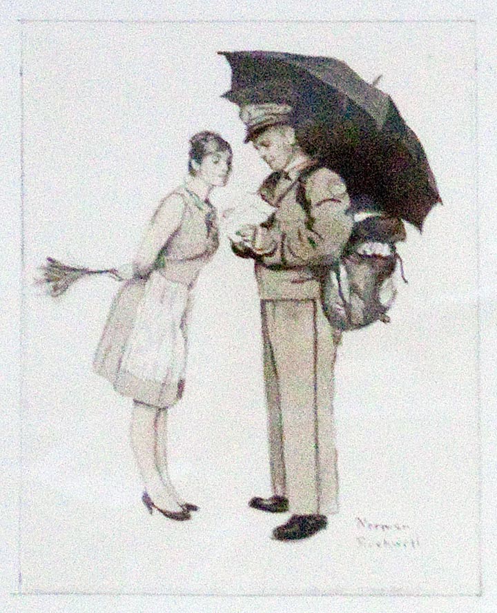
Recently
this Norman Rockwell concept sketch was in the shop
to be re-framed. Rockwell would rough sketch a
proposed painting, present it to a potential client
and solicit feedback. Hopefully he would be awarded
the project, finish the piece, get paid and then move
unto the next project.
Does the fact that an artist is directed what to
paint diminish the art itself? Not at all. Artists
who can support themselves strictly on their own
creative output are rare. And it is a minor step from
an artist taking on a commissioned project to a
full-time commercial illustrator. The net result
might not be an artist's first choice, but finding
opportunity to be creative within the boundaries of a
client's expectations requires both a unique skill
set and maturity as an artist.
This is the segue into an upcoming exhibit that was
just finalized this week. The working title (and it
will change soon) is "Tough Guys and Tough Cookies"
and will be a presentation of original art used for
pulp magazine covers. This art typically presents
scenes of over-the-top drama, usually with somebody
in peril. It is a sub-genre illustration art that
required efficiency and productivity on the part of
the artists. The pay checks were smaller than most of
their colleagues, but it paid the bills and allowed
artists to create art for a living.
This is the third year in a row we have had the
pleasure of working with Grapefruit Moon Gallery. The
first two shows (original pin-up art and original
Cream of Wheat art) were very successful. This will
be a bit different, but consistent with the idea of
presenting 20th century illustration art and various
subsets. More details next week.
The final chapter of the Central Park Bandshell being built
Promptly at 3:30 the ceremonies began, which was the official opening of the Bandshell. The Jones Family Foundation was thanked for their generous donation to the City of Red Wing. This really is an amazing gift; this is akin to having a second Sheldon Theatre, except it is an outdoor venue.
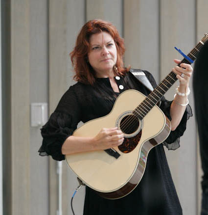
Several
Fiddler on the Roof selections were sung (a teaser
for an upcoming production) and Rosanne Cash and her
husband came out and performed for about 90 minutes.
It was a straightforward performance, very
professional and simple (two guitars). Just a class
act. Then Roomful of Blues picked up the tempo for
the next 90 minutes. The skies cleared (it was
spitting rain on occasion) and the Sheldon Brass Band
took the stage and played mostly some traditional
John Philip Sousa music.
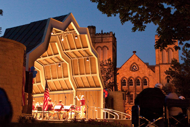
It was the final score, which was Tchaikovsky's 1812
Overture, that something truly remarkable happened.
Right at the crescendo, right at the peak of the
music, cannons began firing off explosions and all
the church bells in town started ringing. Red Wing
has a lot of church bells and between the Brass Band,
the cannons and the church bells, it was a very
moving experience. Several people started
spontaneously crying and it is hard not to get choked
up thinking about it now. The Sheldon Theatre
deserves a ton of credit for making this an amazing
day in Red Wing history.
It has been fun charting the progress of the newest
neighbor in our neighborhood. But now it is time to
move on to other curious topics.
In Our Own Backyard follow-up...
A little over a month ago, a
prototype of the 2009-2010 traveling exhibit of the
'In Our Own Backyard; U.S. Poverty in the 21st
Century' was unveiled at the College of St. Catherine
in St. Paul, Minnesota. This was an opportunity to
weigh the reaction and measure the effectiveness of
the message. Think of this as a preseason event
before the annual Catholic Charities USA convention
in Portland in September, 2009.
Things have not slowed down since then. Details have
been fine-tuned and the new web site can be
found
here. The tentative schedule for the
traveling exhibit is:
September 24-29: Portland, Oregon
October 29, 2009: Sacramento, CA
January 21, 2010: San Antonio, TX
February 24, 2010: Atlanta, GA
March 8, 2010: Albany, NY
March 25, 2010: Nashville, TN
April 22, 2010: Cleveland OH
April 29, 2010: Chicago, IL
Track the updates by following it on Facebook:
![]()
The Red Wing Framing Gallery Panel Print
And now, a word from the sponsor...
For years, people have been complaining that, "if they can put a man on the moon, why can't they put a print on a panel?"
Introducing the Red Wing Framing Gallery Panel Print.
It's a Panel! It's a Print!
It's a Panel Print!
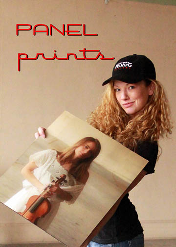
It begins with any digital photo
and ends with a full-print bleed, UV-protected, 1/4"
thick hardboard panel print that is
pool-table
flat and rugged!
The Panel Print has a linen laminate finish and a 1"
reverse frame mount. The mount lays flat on the wall
and the print is an elevated surface that creates a
modern 'drop-shadow' effect on the wall.
It can be printed at any size or aspect ratio (great
for panorama photographs) and it has been especially
popular with photographers who appreciate this very
contemporary look. It also works great for commercial
projects that are restricted from using glass or need
to cover large wall surfaces, yet still need to
project elegance and creativity.
Call the shop today at 1-651-385-0500 and create your
own art from your own images!
Now, back to the regularly scheduled programming.
Anatomy of an Exhibit
The entire exhibit process was documented, so if we let T = the actual exhibit time (4 pm, 04-20-2009), then T-x is some amount of time before the exhibit. Think of the television show '24', except instead of saving the country from terrorists with nuclear weapons, we are hanging art (the lamest metaphor to date on the entire internet).
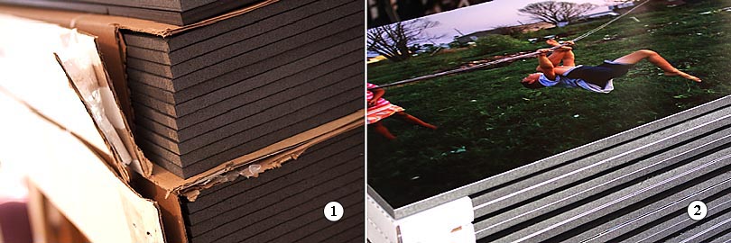
1)
T-2 weeks: Once the project is defined, the supply
chain of raw materials begins to fill up. This
exhibit required two cases of 4'x8'x1/2" black
Gatorboard.
2) T-1 week: Each image was printed on a premium
luster photo paper (a wide color gamut, scratch
resistant, but susceptible to fingerprints), vacuum
mounted to the Gatorboard and then trimmed to size
and packaged. 50 images were printed and mounted for
this exhibit.
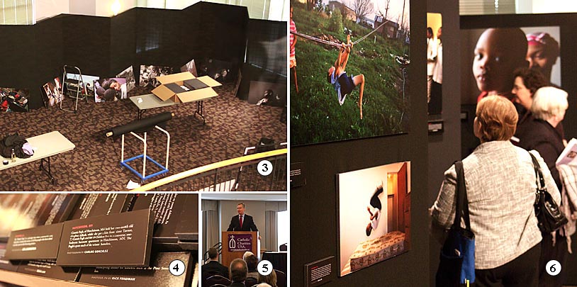
3)
T-24 hours: The finished materials were delivered the
day before the exhibit opening. The exhibit panels
were problematic for a few reasons, but the image
layout was deemed the most critical.
4) T-12 hours: The image title blocks completed the
story-lines. I was delighted to see that Carlos
Gonzales from the Minneapolis Star Tribune was
participating. I came to know Carlos from the Max
Becherer exhibit.
5) T- 4 hours: No exhibit is complete without a
politician. In this case it was the Honorable Mayor
Chris Coleman of St. Paul.
6) T- 0 hours: This exhibit generated a lot of
discussion. A 'first person, photojournalistic' style
was used.
7)
T+x: From St. Paul, the exhibit moves to Portland,
Oregon and then begins a nine city nationwide tour,
with the goal of ending at the White House in 2010.
Math,
art and terrorists in a single blog entry. Now that
is efficient blogging.
Mr. Pin-up...
The
Minneapolis Star-Tribune did a nice story today about
Dan Murphy and his illustration art collection. We
had the pleasure of working with Dan and Sarah on two
different occasions; once in 2007 for The Dream Girl
exhibit and again in 2008 for The Cream of Wheat
exhibit.
Dan has a terrific collection and is a recognized
expert of this genre. I look forward to working with
Dan again this year, maybe with a pulp men's magazine
(think True Detective) or a science-fiction exhibit.
The Strib article can be found
here
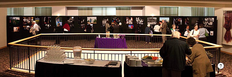
Red Wing Photography Club Exhibition of Photographs
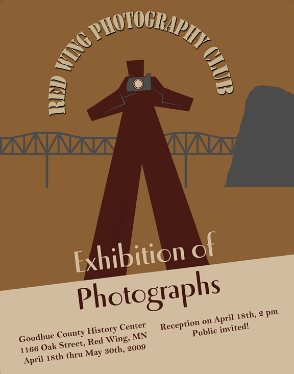
On
April 18th, 2009 at the Goodhue County History Center
(1166 Oak Street, Red Wing, MN) the Red Wing
Photography Club will present an Exhibition of
Photographs.
Ardent readers will remember that this club was
formed about this time last year. This is the first
time this club has formally exhibited members’
photographs. Assuming there isn't a like-wise repeat
of the Rolling Stones incident in Altamont, CA, it is
likely this group will exhibit again.
The rules were pretty simple: no more than three
pieces and nothing larger than 16"x20". And like most
good photographers, the rules were almost immediately
broken.
It
is a non-juried, non-themed, non-competitive,
not-for-sale exhibit. The objective is for
members to share their favorite images and for many
members to exhibit for the first time.
A public reception is April 18th at 2 pm at the
History Center.
I did the poster layout. It is absolutely derivative
of a wpa poster from the 1930's (read: rip-off).
You're welcome and thank you.
The War on Poverty

Steve Liss is an accomplished photojournalist, as
evidenced by having 43 Time Magazine cover photos to
his credit.
But it isn't this professional success that Liss
takes the most pride in. Steve Liss is a humanitarian
who uses photo essays to communicate tough topics.
His subjects have ranged from poverty in the
Mississippi Delta, to runaway youth living on the
streets of Hollywood, to a study of the Nuns of
Mankato and Alzheimer's disease. He has been the
recipient of the Soros Justice Media Fellowship for
his work on juvenile justice and the Alicia Patterson
Fellowship for his work on domestic poverty.
We are delighted and excited to be asked to
participate in his latest project entitled;
In Our Own
Backyard: U.S. Poverty in the 21st
Century
(web site).
This is a unique poverty awareness project being
undertaken by 15+ preeminent American
photojournalists. The project goal is to use the
visual power of large-format documentary photography
to elevate the discussion of making the fight against
poverty a national priority.
This project is in partnership with Catholic
Charities and their campaign to cut poverty in half
by 2020. Nine major photographic and multi-media
exhibits, each with 50 emotionally-moving large
format photographs will tour throughout the United
States begining in the fall of 2009.
This project will be kicked off at a leadership
summit on April 20, 2009 at the College of St.
Catherine, St. Paul, MN. Registration is
here and an invitation postcard is here.
Poverty has many faces and it is impossible to ignore
when seen up close and personal. It is projects like
this that make work seem less like work and more like
purpose.
Cream of Wheat; 1913-1925
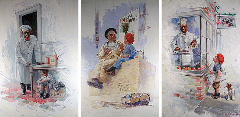
This week we decided to host our first major exhibit
at our new location. It is an exhibit of original art
from the Cream of Wheat advertising campaign from the
period of 1913-1925. It begins on October 10, 2008,
which doesn't leave much runway for a show of this
magnitude, but it was a fairly spontaneous decision
on the part of all the players involved.
The worst thing an art gallery can do is be boring,
and this exhibit is anything but.
This exhibit is fascinating on many levels. To begin
with, the art is amazing. The campaign director was
very insistent on using the best available
illustration artists and the art reflects that. The
imagery is very wholesome and comforting and humor is
a common element in many of the illustrations.
The exhibit also presents and
discusses the use of racial stereotypes in the media.
Times change and so do acceptable standards. The
Cream of Wheat campaign usually used an
African-American chef as a welcoming and reassuring
icon. Was this naive, demeaning or enlightened on the
part of Cream of Wheat?
And finally, Cream of Wheat went from a minor grain
mill in North Dakota to a major worldwide cereal
company in ten years because of their effective use
of advertising and image branding. This alone is
worthy of a Harvard business case study.
Cream of Wheat was located in Northeast Minneapolis
from 1897 to 2002. The company has changed hands
several times and is no longer independent. These
paintings were in storage in the archives of the
headquarters until the building was converted to
condominiums in 2005. This might be the last
opportunity to see a body of work this complete.
The best part of this exhibit is the chance to work
with Dan and Sarah again. We first worked with them
last year for The Dream Girl exhibit and they are a
class act. Maybe next year we can do a pulp fiction
or science fiction theme?