
The missing piece
The Lost Puzzle Piece

Many years ago, a very good framing customer brought in a beautiful antique jigsaw puzzle to be framed. It was from the turn of the 19th century, and the construction itself is a work of art. The pieces are scroll sawed, and several pieces themselves are shaped as children's toys (monkeys, toy soldiers, etc.). It is a remarkable example of craftsmanship.
The only problem was that a single piece of the puzzle was missing. This seemed very tragic, and because of the depth of the puzzle, it was as obvious as a missing tooth on a beautiful model in a toothpaste ad. But, it is what it is, and since it had been in her family for many years, it was decided to frame it up as is.
Jump ahead several years to the present... the customer removes a drawer from a dresser, and lo and behold, the missing puzzle piece reappears from behind the drawer.
There is something very therapeutic in knowing that the missing puzzle piece will soon be reunited with its brothers and sisters, and now the picture is complete.
The Lord works in mysterious ways.
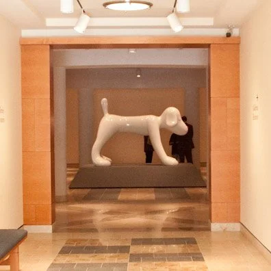
Yoshitomo Nara
Yoshitomo Nara: The Relentless Visionary of Pop Art

Yoshitomo Nara is a 51-year-old Japanese pop artist influenced by anime and punk rock. His sculptures seem cartoonish in nature and typically depict animals or children. Often, his subjects have contradictory elements, such as weapons or accusatory looks that belie their wide-eyed expressions.
The interesting thing about Nara is his consistency. Artists like Nara pursue the same relentless vision regardless of critics. Nara says he is helpless in this matter because he is compelled to create these works.
This fiberglass sculpture, called “Your Dog,” is part of the permanent collection at the Minneapolis Institute of Arts.
The traveling photojournalism exhibit
Catholic Charities American Poverty Photojournalism Project: A Year in Review

It has been a full year since we became involved in the Catholic Charities American Poverty photojournalism project. It has been a rewarding and challenging year, and now a certain rhythm has taken hold as the exhibit crisscrosses the United States. This coming week, the exhibit presents itself in Nashville, Tennessee. The map above demonstrates where the exhibit has traveled (in red) and where it is yet to travel (in blue). Additional cities might still be added, and no final confirmation yet if the final exhibit will take place at the White House.
Steve Liss, the Project Director, travels to each city immediately prior to the exhibit reception, artfully and tastefully documenting the slices of poverty unique to each community. Our job involves image preparation—printing, mounting, and packaging all the images for each exhibit—and delivering them directly to the exhibit venue. Usually, there isn't a single day to spare, and thankfully, UPS has delivered each and every package on time and in perfect condition. Ideally, there would be a larger buffer of time for production, but then, what would be the challenge in that?
It is a challenge, and from every challenge, you hope to learn and improve from the experience.
Upon further review
The Creative and Real Estate Legacy of 312 West Avenue

By going backwards through telephone directories (this is known as 'doing a Jim Rockford') and speaking with Barb Tittle (the previous building owner), it was possible to stitch together a more complete history of this building. It has a very significant creative and real estate lineage.
312 West Avenue Chronology:
1894 - 1902: Lidberg Studio (original location)
1902 - 1920: Lidberg Studio (new location)
1920 - 1936: E. H. Lidberg Real Estate
1937 - 1947: Davison Studio
1948 - 1949: Wood's Studio
1950 - 1952: Hodge Studio
1953 - 1979: Chalet Studio
1980 - 2004: InComm Realty and Maas Realty (later Coldwell-Banker)
2005 - 2007: Gary-Donald Arts, a private art dealer
2008 - Present: Red Wing Framing Gallery
For 73 out of 115 years, this building has been home to six different creative studios. For 40 out of those same 115 years, it has been home to at least three real estate companies.
Put up or shut up!
Reflecting on the Artist's Journey: The 'Foot in the Door' Exhibit

Over the years and after working with countless artists, it's easy to forget the emotional journey they undergo when exhibiting their art. They open themselves up for critical review and significant exposure. They might appear nonchalant or even over-confident about exhibiting, but inside, their stomachs are churning. For me, it was time to put up or shut up.
The 'Foot in the Door' exhibit is different in this regard. It's completely democratic—if it fits in the box, it exhibits. Consequently, it becomes less about the art itself and more about the opportunity to exhibit and have fun. I submitted a photograph I took ten years ago, entitled "Midnight on Mason Street." It was taken in San Francisco, focusing the image exposure on a neon leg, which severely underexposed the rest of the image. The result is two illuminated signs on opposite sides of the street. It's a gimmick photo, but I'm partial to gimmicks. Growing up with comic books, my favorite part was always the Johnson-Smith page on the inside back cover (x-ray glasses and such)—the clearinghouse of gimmicks.
My favorite piece from the exhibit has to be the seed art tribute to wrestler Baron von Raschke. Classic.

The story arc of the Marc Chagall project
Rescuing a Marc Chagall Linoleum Lithograph

Just to refresh... a customer had rescued this original Marc Chagall linoleum lithograph from slowly being destroyed by the mounting and the framing (please see: "How to commit art murder," or, "I ruined a masterpiece, but saved on the framing"...). The mats were leeching acid into the art paper, the non-UV glass was allowing the sun to fade the art, and the MDF frame was slowly dissolving the art with formaldehyde out-gassing.
The rescued piece will be picked up by the customer today, and a ceremony will take place to present the art back to the public library. I thought I would share the design details of this project:
It features a double rag mat design (100% acid-free) with a filet. The bottom mat has a 1" reveal (this is a museum standard for a design with a filet) and the top mat has a 3.25" reveal. The art paper had some waviness, and it is loosely held in place with archival corners on the backside. This allows the art to breathe and respond to the ambient temperature. The outside moulding is called an Amante design, which is a classic moulding style. The glazing is a museum-quality UV glass, which is almost imperceptible. It was decided not to conceal the staining from the previous mats and to incorporate the flawed feature into the overall design.
It looks very classy and is totally reversible for future framers in the event of a re-design.
Respect the art. Protect, preserve, and present the art.
More about 'Foot in the Door 4'
A Visit to the Minneapolis Institute of Arts

I love the Minneapolis Institute of Arts (MIA). I know that isn't a profound observation for anyone who has ever visited the MIA, because anyone who has ever visited it also falls in love with it. It offers a friendly and welcoming arts atmosphere (which isn't as common as you would hope), the art is terrific, and it's free. What's not to love?
Be that as it may, the 'Foot in the Door 4' exhibit is shaping up nicely. I had the chance to visit a second time before the public unveiling. The total submissions were beyond all estimates, and the lines were long for nearly the entire four-day submission period. The final number is a closely guarded secret until the public reception, but sources close to the count have provided a range of between 4,700 and 5,000 entries (compared to 1,700 submissions ten years ago, the last time this exhibit took place). Three large gallery rooms will be filled, and the raw expression of creativity is almost overwhelming.


I managed to find my piece and two of the three pieces I had submitted on behalf of friends and family. It looked as if about half the art was up, and I did hear that all of the art had been photographed for the online gallery.